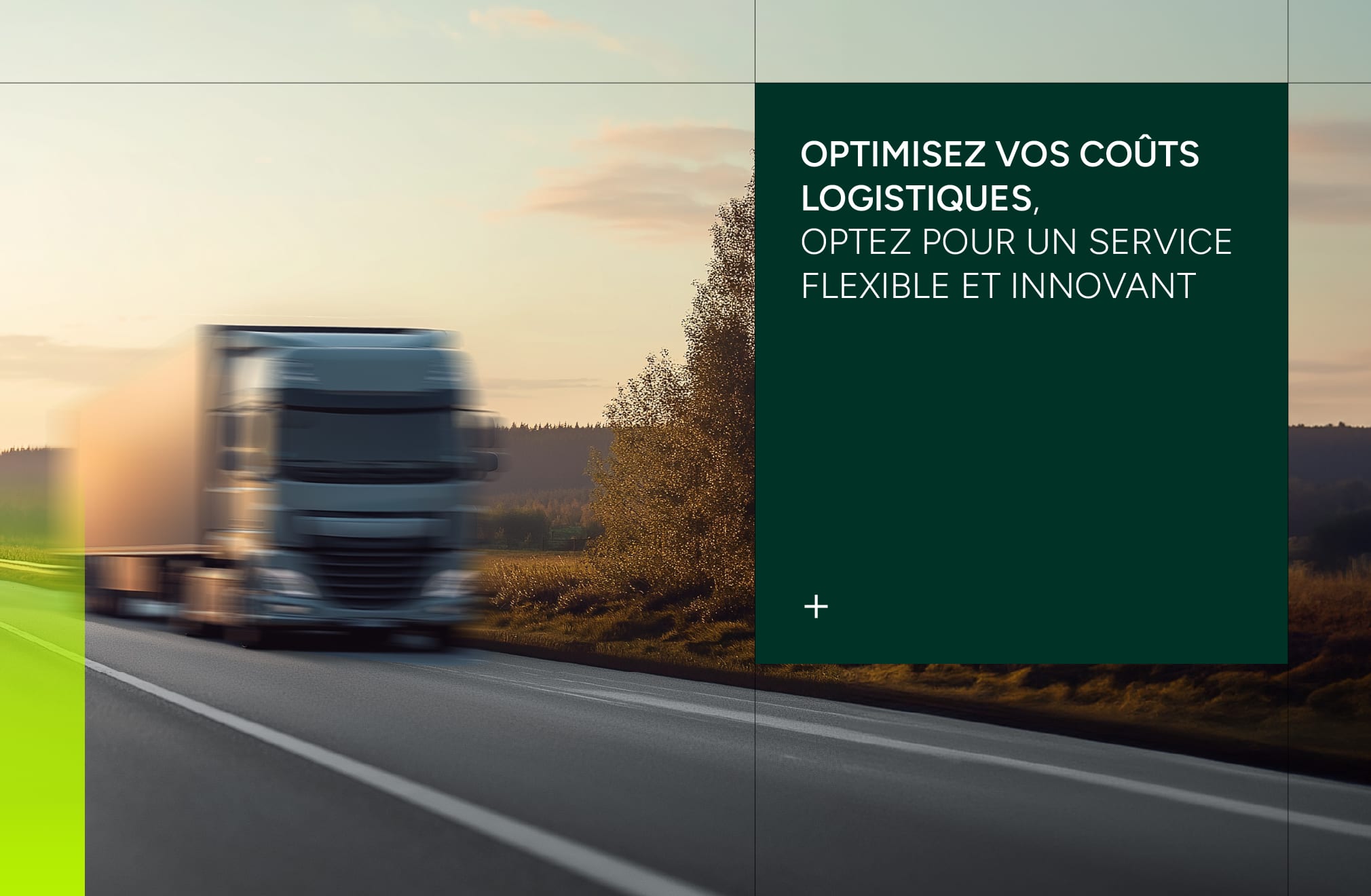
Waresito is a company specialising in outsourced storage solutions and tailor-made logistics and transport services for every customer, throughout France. By offering flexible, customised services, Waresito helps companies optimise their supply chain while meeting their specific requirements.
Expectations
Using a modern, technical approach, we have created a visual identity that reflects Waresito's core values: flexibility, transparency and sustainability.
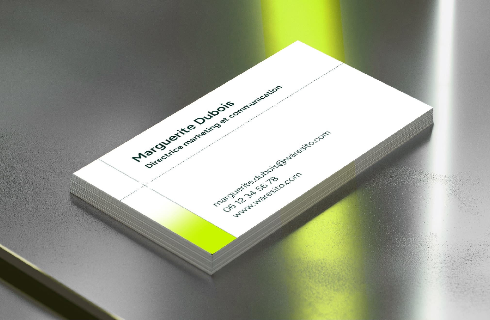
The logotype is built in a precise, technical and flexible linear style that reinforces the brand's logistical expertise. The "+" sign hidden in the letter "t" symbolises Waresito's added value: "A + for your logistics". This typographic choice is echoed in the universe, which combines significant colours such as yellow, symbolising technology and movement, and dark green, representing sustainability. This visual combination embodies reliability and innovation.
Human and flexible branding
Our expertise in graphic design has enabled us to create a graphic system that is both orderly and flexible, providing a legibility and roundness that expresses the modernity and human aspect of the brand.
Personalised communication
Waresito's communication is also based on a customised offer to meet the specific needs of its customers, guaranteeing them flexible and predictive 100% logistics solutions.
Waresito is therefore positioning itself as a key player in the outsourced storage and logistics sector in France. Thanks to a targeted communication strategy and a strong visual identity, Waresito is well placed to meet the specific needs of businesses while promoting efficient and sustainable logistics solutions.